

Treemap charts are one of the most efficient and visually appealing ways to represent hierarchical data. They can be used to display a variety of information, such as the size of files on a disk, the sales figures of a company, or the structure of a website. Treemap charts are a great way to visualize data, but they have their pros and cons. Keep reading to learn more about treemap charts.
What are treemap charts?

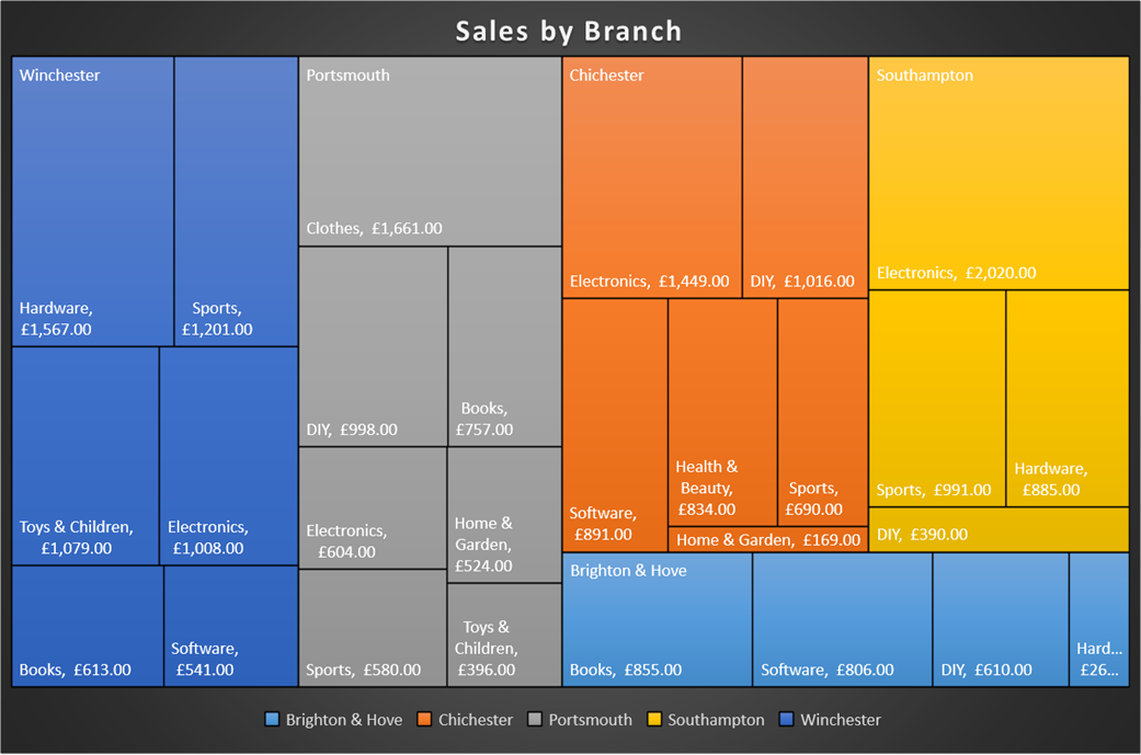
Treemaps are a special type of chart that display hierarchical data as a set of nested rectangles. The area of each rectangle is proportional to the value represented in the hierarchy. Treemaps are used to visualize different parts of a whole data series. When you look at a treemap chart example, you will notice that each node is represented by a rectangle, and child nodes are nested within their parent’s rectangle. Treemaps are a great way to visualize hierarchical data, as they make it easy to see how the values are related. They can be used to visualize data that is hierarchical in nature, such as the structure of a website or the structure of an organization.
How do treemap charts work?
In a treemap chart, each branch of the hierarchy is represented by a rectangle, and the size of the rectangle is proportional to the value of the data within it. This makes it easy to see which branches are larger or smaller than others and to get an overview of the entire hierarchy at a glance.
In order to read treemap charts effectively, you need to understand how the charts are organized and how to interpret the data. Treemap charts are divided into a series of rectangles, with each rectangle representing a category. The size of the rectangle reflects the amount of data within that category, and the color reflects the type of data.
You can usually interpret the data in a treemap chart by looking at the percentages in the colored rectangles. For example, if you want to know what percentage of the data is in the blue category, you would look at the blue rectangle and see that it is 10%. You can also use the treemap chart to compare data between categories. For example, if you want to know what the difference is between the blue and green categories, you would look at the two rectangles and see that the green rectangle is larger. This means that the green category has more data than the blue category.
What are the benefits of treemap charts?

There are many benefits of treemap charts, which is why they are becoming an increasingly popular data visualization tool. Treemap charts are an efficient way to represent hierarchical data. The nested rectangles make it easy to see how much space each data point takes up, and the color coding makes it easy to see the relative proportions of each data point. This makes them a great choice for data visualization beginners, who may find other chart types difficult to understand. Treemap charts are also versatile and can be used to display a wide variety of data types, including financial data, geographical data, and product data. This makes them a great choice for data visualization projects of all kinds.
 The $100K Skill Nobody Taught You: Prompt Engineering Explained
Additionally, treemap charts are interactive, which means that users can drill down into the data to get more detailed information. This makes them an ideal choice for data exploration and analysis. They can also be used to create interactive dashboards, which allow users to interact with the data and make decisions based on that data.
Treemap charts are not only easy to read and understand, but they are also visually appealing. This makes them a great choice for presentations, reports, and other documents where you want to make a good impression. Finally, treemap charts are scalable, which means that they can be used to represent data of any size. This makes them a great choice for data visualization projects of all sizes.
What are the cons of using treemap charts?
Treemap charts are a useful data analysis tool. However, there are limitations that you need to be aware of. They can be difficult to read if there are too many levels or if the values are very small or large. This is because it can be hard to see where one rectangle ends and another begins. Additionally, it can be tricky to determine what specific value corresponds to a certain position on the chart. You may need to zoom in or hover over different parts of the chart in order to get an accurate reading.
Finally, if you want to compare two different sets of data, you have to create two separate treemap charts – one for each set of data. This can be time-consuming and difficult if the data is complex.
Overall, treemap charts are an important tool for data visualization. They allow users to see the relationships between data points in a way that is easy to understand. Additionally, they can be used to compare data sets and find trends.