“Design is not just what it looks like. Design is how it works.” – Steve Jobs
What happens to websites which are not professionally designed? How do visitors react when they encounter a website that is not comfortable to operate and easy to navigate?
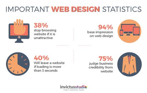
Have a look at these statistics, that directly implies how important a good web design is:
- 94% of the visitors closed websites and stopped trusting the site if it has a degraded web design
- A study of Fortune 500 websites showed that 63% have content above the fold, 50% feature a scrolling content window of some kind, 63% use high-quality images that connect with their users, and the average loading time is 6.5 seconds
- 67% of shoppers showed more interest to buy from a website if it is compatible with mobile devices
- Two out of three people prefer to browse through a beautifully designed website
- 94% of all first impressions on a website are design-related
What do people look for, when on a website?
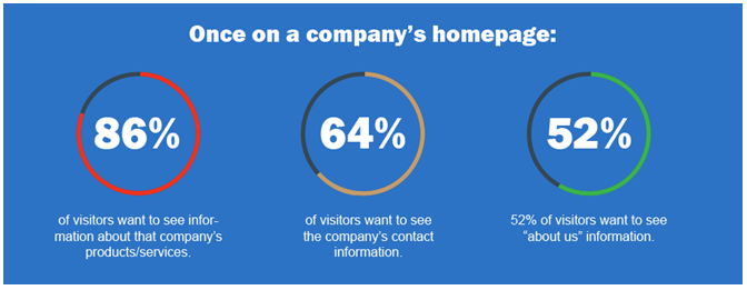
Users are not always looking at a cluttered, colourful, fancy website. Web designing involves the art of showing the major elements on the website in such a way that it conveys all that needs to, exactly the way users would like to see it.
Web design encompasses many different skills and disciplines in the production and maintenance of websites. The different areas of web design include web graphic design; interface design; authoring, including standardised code and proprietary software; user experience design; and search engine optimization. – Wikipedia
Web designing is the most critical component of an effective website. In terms of usability, look, feel, navigation, comfort level, performance – a website must have a professional and well-thought-of design. It must offer the right information at the right time, with minimal efforts and downtime. This is critical for organizations to maintain their brand reputation.
Why is an effective web design important?
Why Is the Web Design Not Getting A Good Response?
There is so much invested behind the web design of any website. What you expect is a lot of visitors coming up but what happens is the reverse. There is less traffic on the site, the bounce rate is not good. Why? The basic reason lies in the poor web design.
What could possibly be the reasons for the web design not to perform the way it should?
Are you not getting enough traffic conversion (from visitors to customers)?
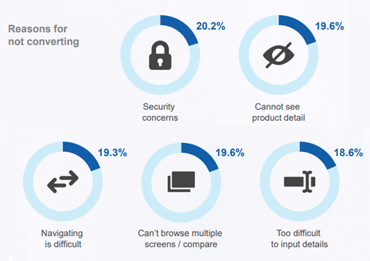
Here are some of the major hurdles:
- Complicated and untidy home page – an unfriendly experience
- All content and no graphics make a website boringand ineffective
- Incorrect positioning of call to action or missing call to action
- Backdated/unresponsive design
- Less sharing of documents with clients who are the best marketing media
- Tough navigation and difficulty in putting in detail
- Security concerns and tough to browser through multiple screens
“Good Design is Good Business” – Thomas Watson Jr.
Key Guidelines That Can Help Offer Best of Web Designing Experience
Keep It Simple, Smart
That is the key! Keeping it simple yet smart. Users look for fulfilment of their requirements rather than cluttering the entire space with information. Feel free to keep space between information so that there is clarity. It is not essential that having too many features will make your website look better and perform effectively. In fact, there must be a striking balance between what feature to showcase and what not. The main objective of the web design must not be compromised. In terms of colour, font and image, the design must stick to the organizational brand being depicted. It gels well with the organizational objectives and looks more convincing in front of the user.
Maintain Easy and Smooth Navigation
One of the worst experiences for a user is to get misguided as to where to go, in the site. Navigation is one important aspect of a good web design. There must be a lot of thought process involved while working upon the navigation standards. Be it call to action buttons at relevant places, further processing buttons, proper visual effects – these are all a must for easy navigation and user satisfaction. Even proper headings, sub-headings, bread crumb tails, sectioning, section/content paths must be well defined and clear.
Do not Overdo Anything. Maintain Equilibrium
Going overboard on any element may cause adverse effect. This holds true especially when you have users visiting a website or working on a web app. For each of the element – visual effects, navigation, responsiveness, buttons, chatbots etc., be sure to use all elements in proportion, rather than going overboard by offering too much. Placing too many of these elements may put the user in confusion rather than making it look crisp and clear. Hence, avoid overuse of elements.
Have a Self-Explanatory Website
It is of prime importance that when the users navigate through the website, they are comfortable in understanding the website on their own. That is, the website must be self-explanatory. The layout must be simple, the registration must be easy and quick, the menu items must be visible instantly, any kind of queries must be attended immediately – these are few of the must want while designing any website.
Ensure Faster Loading Time
If your site takes a long time to load, you are sure to lose your visitors. Users are uncomfortable to waiting for the web page to display, after a certain number of seconds. On an instinct, they tend to move away from the site to some other. Also, having a longer load time may affect the site’s ranking in search engine results. One good way of having a faster loading time is optimize the images, code, JavaScript data involved or make use of cutting-edge technologies of today.
Have a Mobile-Friendly and Responsive Design
It is a bare fact that almost the whole world is mobile driven now. Any website/web application that is designed must be done keeping in mind the efficient working of the same on a mobile device. It must be responsive by nature, adapting to the variety of display/screen sizes that mobile devices carry. Effective working of a website or app on any kind of mobile devices is an essential ingredient in the overall acceptance of the design by users.
Maintain Readable and Clear Typography
After all, it is the text that is prime for any user to move ahead on the website. Hence, maintaining a clear syntax, readable language is highly essential. Also, essential usage of keywords, meta data and SEO related information is needed for users to easily understand the meanings. Parameters such as font size, font name, spacing between lines etc. must be focussed upon. Even the writing must follow usual norms that are understandable to users at one go. They need not be too lengthy or too short.
Follow User Centric Philosophy
Whoever designs the website or applications, it is the end user/visitor who is going to use it. Happier the users, more effective is the design. All the feature embedded are meant for the users to understand on their own and then use it. Hence, the design must be created keeping in the mind the user’s perspective, wishes, needs, constraints etc.
Keep Testing Your Design Regularly with User Perspective
However, much you think you understand the users and their needs, it is finally when you implement the design, that you understand the output. Hence, it is vital not to keep waiting to test till the last minute. As and when the design creates a shape, it must be tested keeping in mind the user perspective so that whatever changes are seen, can be managed at that time itself. Performance testing, functional testing, load testing, user testing – all of these are a must during the creation of the website and especially during the design phase.
Follow a Consistent Pattern Throughout
It is important that all design elements follow a consistent pattern throughout the website. Yes, there may be changes as per needs but at most places, all elements like fonts, sizes, headings, subheadings, buttons, list boxes, spacing, images etc. must follow certain standards (for e.g. CSS) so that they look aligned. Consistency showcases higher professionalism and discipline. It gives a winning tough to the design and a comfort level to the users as they navigate around all pages.
Involve Communicating with the Users
For the users to get involved on the website, it is important to have certain communication techniques in the design itself. It could be using chatbots, virtual assistance, comment boxes, contact us page etc., at different genuine points, so that the user feels more involved and wishes to interact more.
Plan Your Web Design Prior to Kick-off
Before you start design of the website, it is important that you plan the entire activity with all relevant components in place. Analysing the needs of the users, relevant content they will be interested in, further action items to be showcased, mapping of user’s journey till they are clients – these are few of the planning activities that need focus before designing. If done in a proper manner, the design is sure to turn out exactly as per user needs.
Exclude Unnecessary Elements Right from Start
There could be certain elements on the website that could distract the users from the main content they are looking for. It is important to study that, prior and exclude those right from the design. It could be complex images, lengthy content, unnecessary images/visuals etc. Even in the content, it must be ensured that the writeup should be precise and adhere to the point, rather than writing lines of description.
Incorporate Social Media Connections Appropriately
Social media forms the pulse of business today. Though there are distractions it involves, it has become an almost mandatory ingredient in any website. The web design must incorporate social media links, their relevant buttons at appropriate locations on different web pages. These buttons must be displayed in such a way that they do not disturb the user’s navigation in any way but at the same time, are easily viewable when needed.
Place CTA at Right Places
Call to Action is important for any user to exactly find out what he/she wants to do next. Hence, this feature must be incorporated right in the design phase so that it appropriately fits in the right place. Call to Action could be in the form of links, buttons etc. It helps the users to understand and move towards what they are looking for, instead of getting confused of further course of action.
Place Images Suitably
Sometimes, designers feel placing images at every other place makes the website look attractive and colourful. But that is not always right. Placing images unnecessarily may hamper the user’s smooth flow of reading and hence distract their attention. Also, it is not viable to place images that do not match the topic being discussed. That would give a very unpleasant impression to the users and may not retain their curiosity to stay on the website further.
Have Interesting & Scrolling Elements on the Home Page
The current trend goes in for multiple topics/headings on the home page, which, when clicked, will lead to inner detailed pages. But it is recommended that the home page has a list of scrolling heads so that the user gets a look and feel of most important topics briefly. It could majorly involve overview, introduction video, products and services, about us, testimonials, case studies, blogs, contact us section etc.
On a Final Note
Web designing has been a key aspect in the successful run of a website/ web application. Adhering to these key tips will surely help organizations undergo web application development to develop platforms that will generate a of visitor traffic, garner more business, and leads and thereby maximize the revenue. After all, design is thinking made visual!


 How Mobile Technology Is Transforming Sports Betting Experiences

